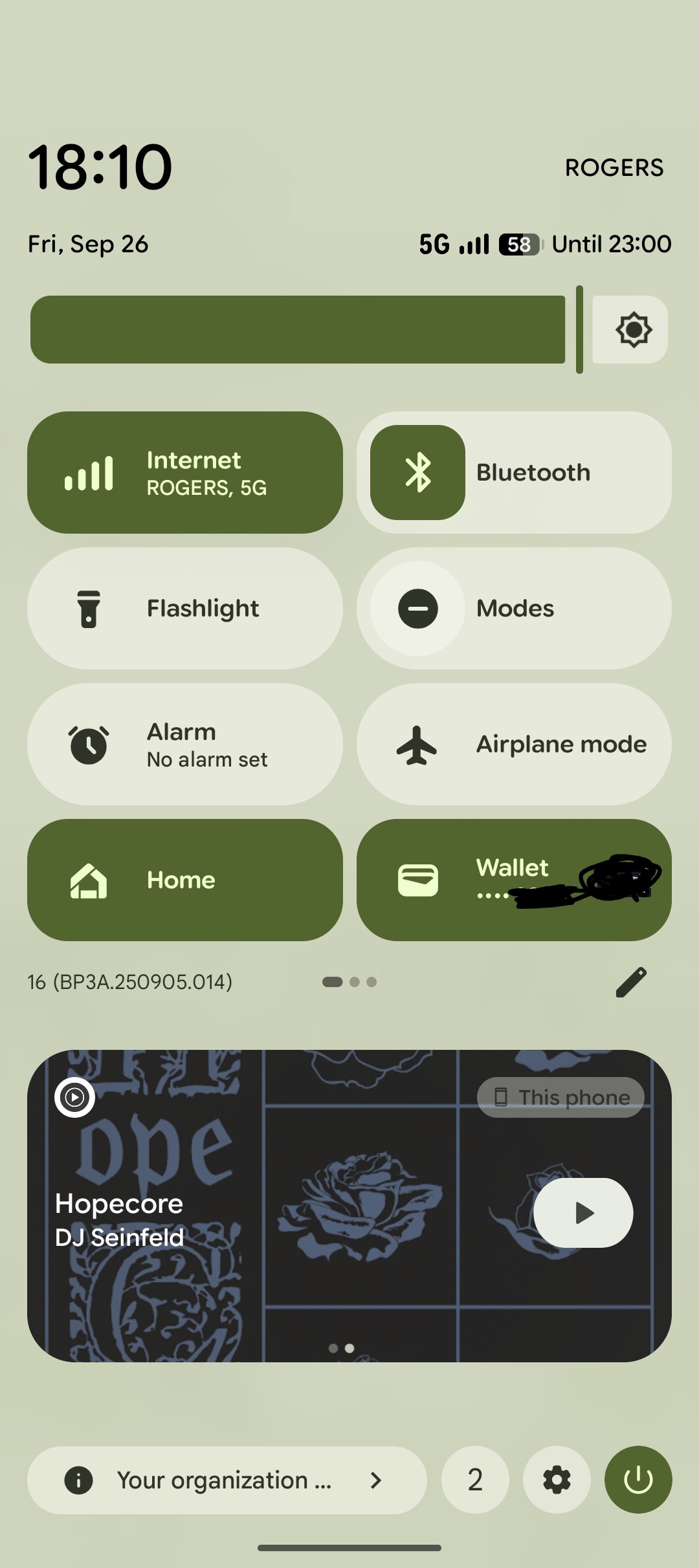
everything is iOS in the future

everything is iOS in the future
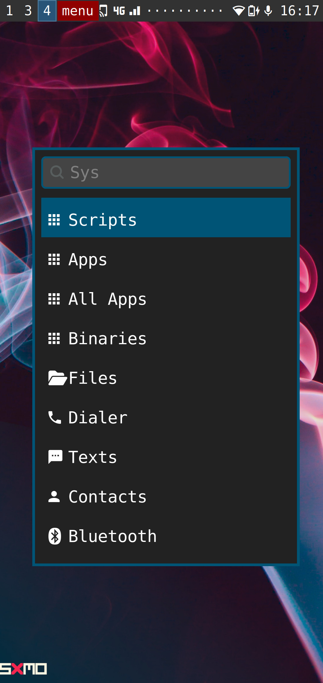
Meanwhile in Linux phones:
I’m an iOS user but stock android is the only one that’s any good in my view. There’s no reason that notifications should pull down over the current view but control center should float on top of it. It’s weirdly inconsistent. Also pretty much everything about notifications on Android is better, which is a shame since it’s pretty core to the user experience.
What exactly is the point of the volume slider in the control panel? You have two wonderful buttons for that...
I would personally argue theres no need to reinvent the wheel just for the sake of being different. As of now we dont really have something that looks better of funtions better (on mobile) so thats what companies embrace.
The latest version of Android looks even more like an iPhone than what is pictured.
i miss android 5
Everything’s computer iOS
I think that’s actually part of the reason they are doing Liquid Glass. Everything looks like iOS in its current state. Supposedly the compute required to calculate the light refractions in iOS 26 will make it more difficult to copy. This is not an endorsement of Liquid Glass. Just what I’ve heard… though personally I don’t dislike it.
Not a very popular opinion, but I actually love this design. Especially google pixel's.
It works well enough
You forgot nothing OS!
all 49 comments