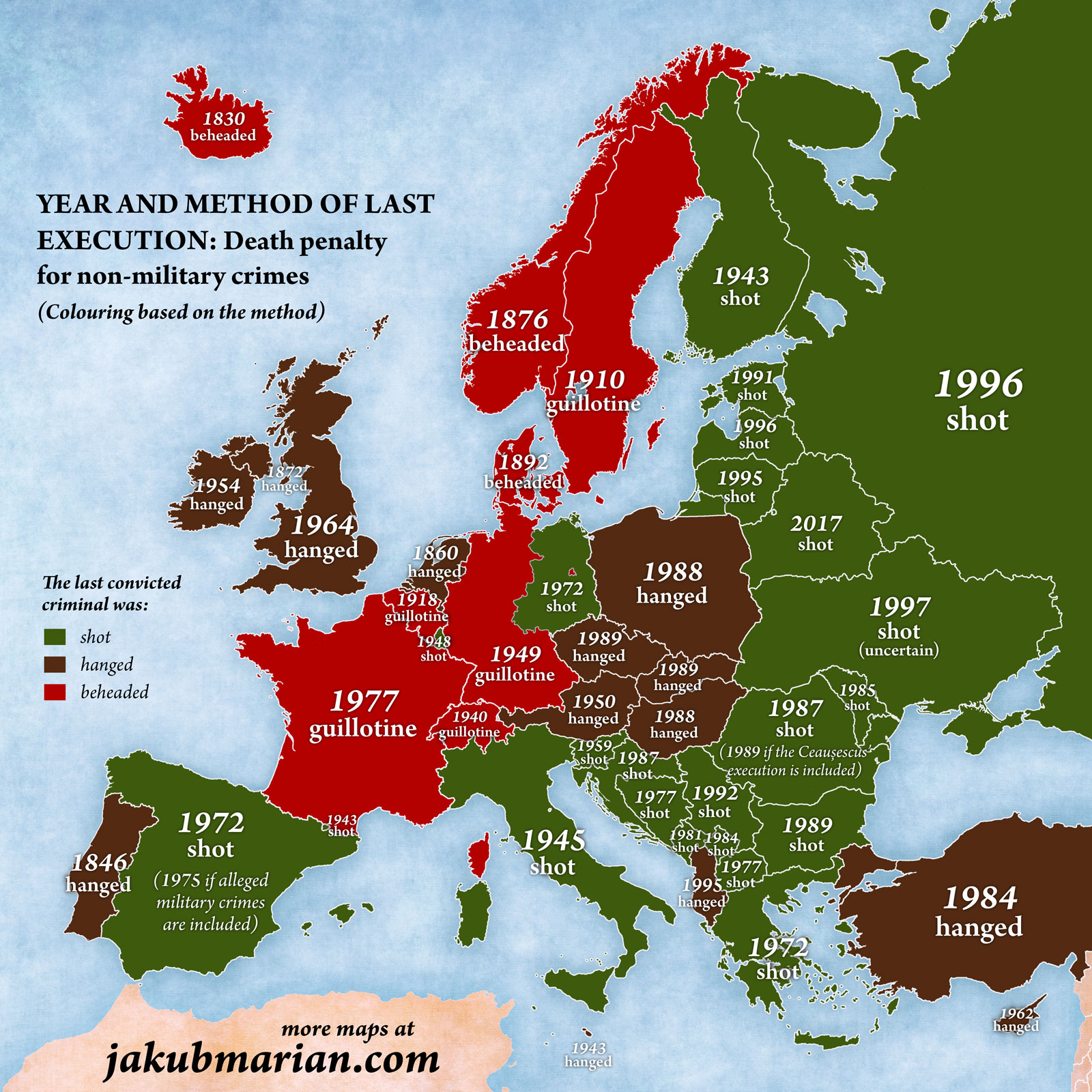
Due to the methods and years being roughly correlated the colour scheme makes it look like the map is saying that more recent is better
you are viewing a single comment's thread
view the rest of the comments
view the rest of the comments
Due to the methods and years being roughly correlated the colour scheme makes it look like the map is saying that more recent is better