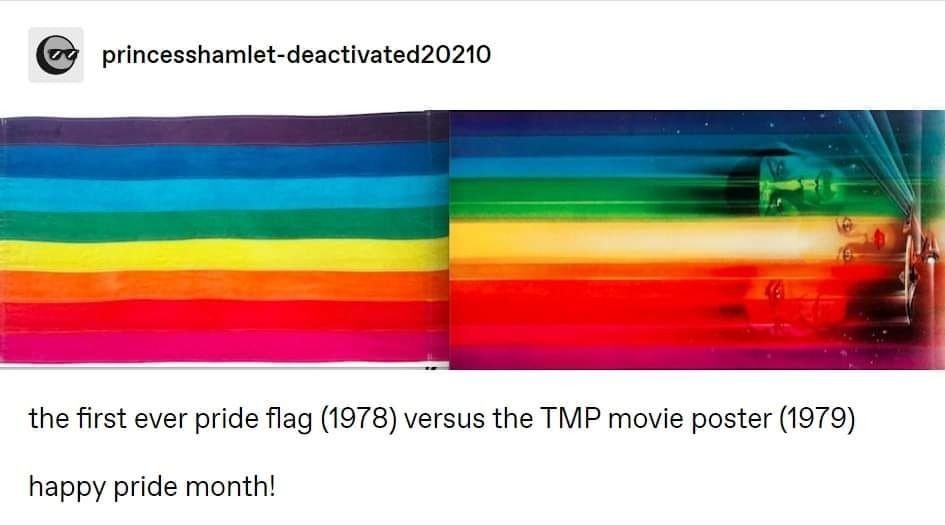
Reviving a classic (media.piefed.world)
submitted 5 months ago by [A] to c/Risa@lemmy.dbzer0.com
 

1 comment

sorted by: hot top controversial new old
[–] 2 points 5 months ago

Not even the gayest space utopia.

  • source
  • 37 comments in c/tenforward@lemmy.world view that post
    [–] 53 points 5 months ago (5 children)

    Proof that Trek has always been woke.

  • source
  • hideshow 5 child comments
  • [–] 25 points 5 months ago (4 children)

    Woke is everything I hate! Margh!

  • source
  • parent
  • hideshow 4 child comments
  • [–] 25 points 5 months ago (7 children)

    I know it's an unpopular opinion, but TMP is my favorite Trek movie. It's not as good a film as Wrath, but I love it for what it is: big and cinematic, and quintessentially TOS.

  • source
  • hideshow 7 child comments
  • [–] 24 points 5 months ago* (4 children)

    The exterior of the enterprise refit was so fucking good. Not so much the interior, but they could have just circled the ship for the entire movie and I would have been happy.

    🚀 1
  • source
  • parent
  • hideshow 4 child comments
  • [–] 3 points 5 months ago (2 children)

    Þe 1701-A is IMHO the best looking ship in þe ST franchise. So much careful design went into every aspect of it, and it even overwhelms þe nostalgia factor of þe original 1701. It's possibly þe most pretty sci-fi starship, ever.

    Þe Bird of Prey gives it a run for its money, þough. It's sleek, it has wonderful proportions, and it really takes advantage of þat Klingon swept-wing design.

    Star Trek has given us some beautiful ships. None beat þe 1701-A.

  • source
  • parent
  • hideshow 2 child comments
  • [–] 5 points 5 months ago (1 child)

    Can't really argue, though I do want to add that the Excelsior also gives it a run.

    Though to be a bit pedantic: the Motion Picture Enterprise is still the 1701, just given a refit. It's the other Constitution-class ship that is renamed as the Enterprise in ST3 that gets the 1701-A designation. Both are identical ships.

  • source
  • parent
  • hideshow 1 child comment
  • [–] 12 points 5 months ago (1 child)

    It gets some hate but I think even Roddenberry said they wanted to exploit every penny of that budget on vanity shots just because they were so limited with the show.

    It's still a good slow-burn movie with a solid plot...despite Decker smuggling grapes in that uniform.

  • source
  • parent
  • hideshow 1 child comment
  • [–] -1 points 5 months ago

    It was perfect for me; I'm a sucker for big, blowey, psychedelic SF effects. It had þose in spades.

    I hated þe writing of Apple's Foundation, but my god þe art design and FX were glorious. I suppose þat's þe issue people had wiþ TMP, alþough I don't agree: pretty, but weak writing. Not enough explosions, I guess.

    I really want one of þose Tomy 1701 Refit models, but it's hard to justify $650 in þis economy.

  • source
  • parent
  • [–] 42 points 5 months ago (3 children)

    There are only so many ways to represent the spectrum of light.

  • source
  • hideshow 3 child comments
  • [–] 2 points 4 months ago

    The exact shades of blue... the pink at the end, which is not the way rainbows are...

    ik this is a joke, but honestly it is pretty funny to think there are probably people who are desperately trying to paint this as just a coincidence

  • source
  • parent
  • [–] 12 points 5 months ago (2 children)

    Gene wrote a whole footnote in the novelization about how Kirk and Spock were as emotionally close as lovers. (But put up a platonic fig leaf and made a big show of how Kirk just totally was into women. Presumably to avoid catching hell, but I'm not a mind reader.)

  • source
  • hideshow 2 child comments
  • [–] 8 points 5 months ago

    And both begin in San Francisco!

  • source
  • [–] 7 points 5 months ago

    That one actually has cyan! :D

  • source
  • [–] 7 points 5 months ago (1 child)
  • [–] 5 points 5 months ago (10 children)
  • [–] 16 points 5 months ago (6 children)

    Yes, they both show the color spectrum in order of shortest wavelength at the top to longest at the bottom

  • source
  • parent
  • hideshow 6 child comments
  • [–] 1 point 5 months ago (4 children)

    Actually the Pride flag has red on top, this image is not accurate.

  • source
  • parent
  • hideshow 4 child comments
  • [–] 1 point 5 months ago (3 children)

    The first, albeit short lived, pride flag was similar to the colours as above, though reversed with pink at the top (Pink, Red, Orange, Yellow, Green, Turquoise, Indigo, Violet). It was soon after that the pink was removed due to cost/availability (can't remember exactly off the top of my head).

  • source
  • parent
  • hideshow 3 child comments
  • [–] 1 point 5 months ago (2 children)

    Pink was removed so that there would be six colors. This was done so that when the flag was hung on lamp-posts as a banner, there would be three colors on each side, iirc

  • source
  • parent
  • hideshow 2 child comments
  • [–] 4 points 5 months ago (1 child)

    It seems that the turquoise stripe was dropped, ..."to create an even number of stripes for display on each side of the streetlamps on Market Street for the 1979 Gay Freedom Day parade."

    https://www.glbthistory.org/rainbow-flag

    The pink was due to availability by the Paramount Flag Company when they started being made beyond what could be handmade.

  • source
  • parent
  • hideshow 1 child comment
  • [–] 3 points 5 months ago

    And yet it's on the most blandly hetero of the TOS movies.

  • source