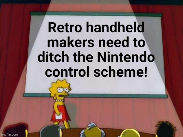
[A] on bottom, [B] on right is the industry standard. Nintendo is the outlier and the control scheme sucks.
(slrpnk.net)
Sega, Xbox, Steam - and functionally speaking, even Sony all default to a face button scheme with the action/enter/accept button on the bottom, and cancel/back on the right. Nintendo's control scheme is really the primary thing that throws a wrench in retro handheld setups. It's also just a bad layout. X on top? What is that nonsense?