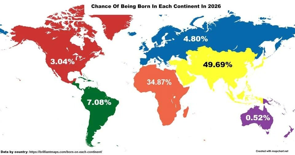
▲ 341 ▼ Chance of Being Born in Each Continent in 2026 (media.piefed.world) submitted 10 months ago by The_Picard_Maneuver@piefed.world to c/map_enthusiasts@sopuli.xyz 80 comments fedilink hide all child comments
[–] Sharkticon@lemmy.zip 19 points 10 months ago (4 children) Siberia is not part of Europe you weirdos. permalink fedilink source hideshow 4 child comments replies: [–] schnurrito@discuss.tchncs.de 6 points 10 months ago (1 child) One could say the map simply counted transcontinental countries as where the majority of the population lives, but French Guiana isn't colored like Europe. Also interesting that the southern border of Mexico is apparently the border between North and South America. permalink fedilink source parent hideshow 1 child comment replies: [–] DragonTypeWyvern@midwest.social 2 points 10 months ago* Yeah the most interesting thing about this map is the weird biases on display. Personal guess? This was made by a white supremacist to try and push replacement theory/14 words type fears without tipping off the normies permalink fedilink source parent [–] OneWomanCreamTeam@sh.itjust.works 3 points 10 months ago It's part of Afroeurasiaca permalink fedilink source parent [–] polysexualstick@lemmy.world 2 points 10 months ago I'm sure the massive number of people being born in Siberia makes this map completely useless /s permalink fedilink source parent
[–] schnurrito@discuss.tchncs.de 6 points 10 months ago (1 child) One could say the map simply counted transcontinental countries as where the majority of the population lives, but French Guiana isn't colored like Europe. Also interesting that the southern border of Mexico is apparently the border between North and South America. permalink fedilink source parent hideshow 1 child comment replies: [–] DragonTypeWyvern@midwest.social 2 points 10 months ago* Yeah the most interesting thing about this map is the weird biases on display. Personal guess? This was made by a white supremacist to try and push replacement theory/14 words type fears without tipping off the normies permalink fedilink source parent
[–] DragonTypeWyvern@midwest.social 2 points 10 months ago* Yeah the most interesting thing about this map is the weird biases on display. Personal guess? This was made by a white supremacist to try and push replacement theory/14 words type fears without tipping off the normies permalink fedilink source parent
[–] OneWomanCreamTeam@sh.itjust.works 3 points 10 months ago It's part of Afroeurasiaca permalink fedilink source parent
[–] polysexualstick@lemmy.world 2 points 10 months ago I'm sure the massive number of people being born in Siberia makes this map completely useless /s permalink fedilink source parent