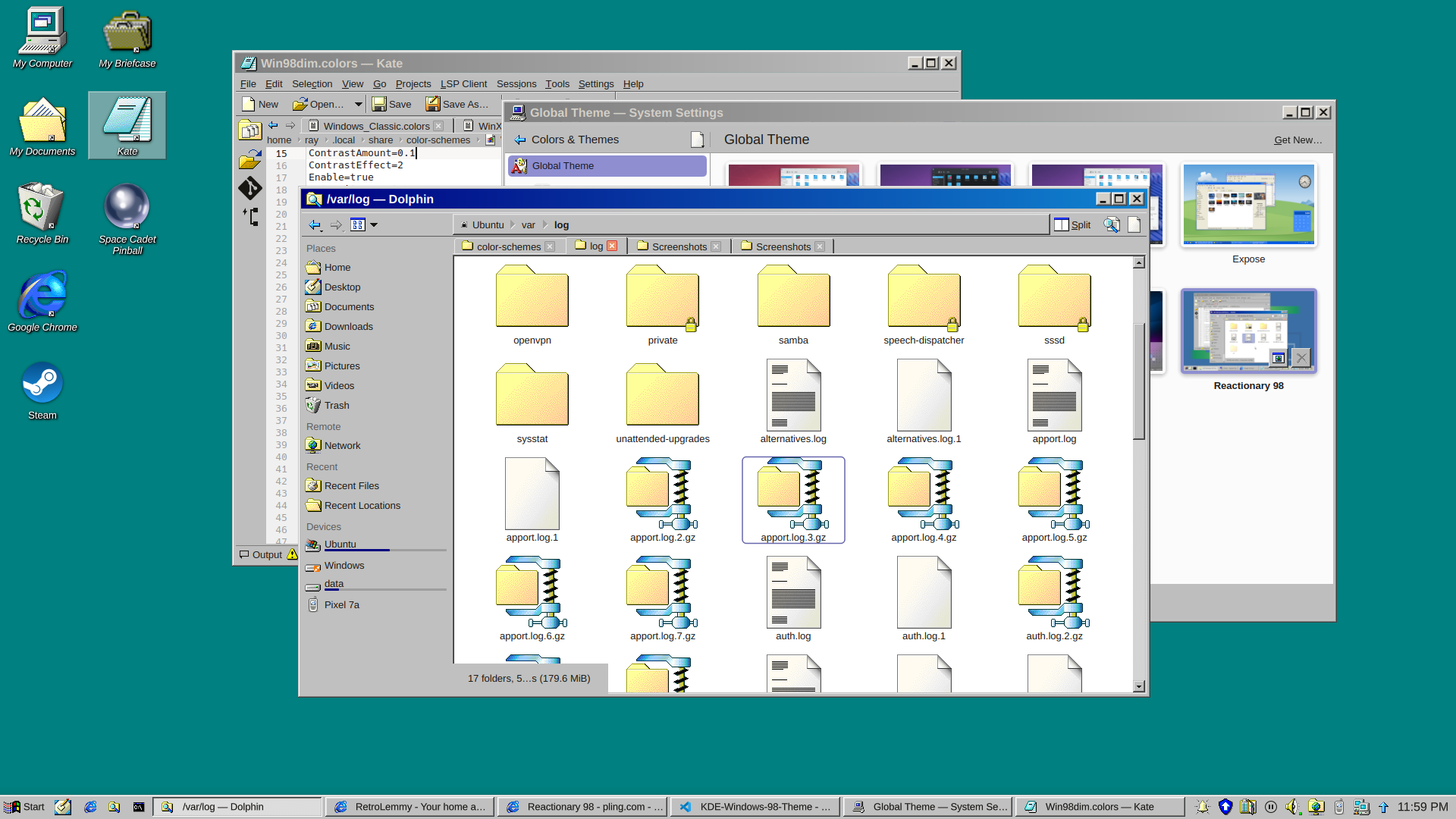
EDIT: v0.9 released

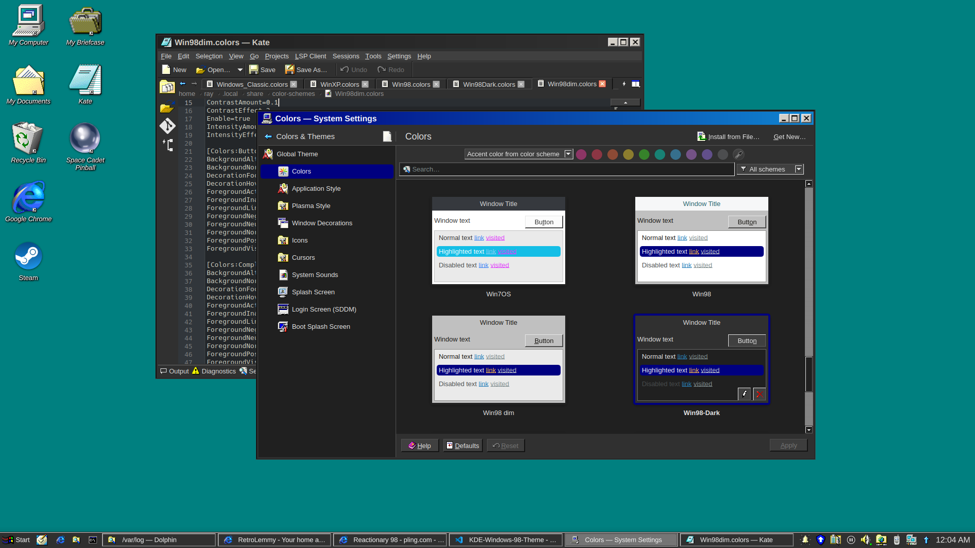
and a dark version

I really just put a bunch of pieces together. Forked from Reactionary Plus, but swapped out the icons, cursors, window decorations, color scheme, and made some slight tweaks to the layout.

More screenshots and changelogs here: https://store.kde.org/p/2330858

To install this, open System Settings, go to Colors & Themes -> Global Theme. In the top right there's a button for "Get New...", wait for it to load (it's very slow) then search for reactionary, and wait again, then install Reactionary 98.

This is my first time messing with any of this stuff, it was a bit janky lol.

you are viewing a single comment's thread
view the rest of the comments
[–] 5 points 11 months ago (10 children)

In my mind it's weird to use any light theme at all now that dark themes are widely available, but if you are going to, this isn't any weirder than any other.

Another disadvantage it seems to have over many other themes is that in tabbed interfaces there is no color bar on the currently active tab, so you can't spot the currently active tab as quickly.

  • source
  • parent
  • hideshow 10 child comments
  • [–] 8 points 11 months ago (3 children)

    In my mind it's weird to use any light theme at all now that dark themes are widely available

    Dude, preferences. And not everybody uses their computer in a dark room.

  • source
  • parent
  • hideshow 3 child comments
  • [–] 2 points 11 months ago (2 children)

    It isn't any of my business whether other people use light themes... but IMHO dark themes are just so much easier on the eyes, no matter the surrounding light, that I don't get why anyone would if they have the option.

  • source
  • parent
  • hideshow 2 child comments
  • [–] 4 points 11 months ago* (last edited 11 months ago)

    For me, light themes are easier. Especially jarring, if a website forces a dark theme on me (theres's a easy-to-use @prefers-color-scheme, use that, will ya). And syntax highlighting on dark just doesn't work for me, no matter the scheme.

  • source
  • parent
  • [–] 1 point 11 months ago

    Dark theme is hard to read in a brightly lit open office with sunshine. Your pupil contracts and then dark stuff become really hard to make out, especially interfaces where they have blue in black.

    Thankfully my GNOME desktop has a toggle of light dark that is super accessible, and I can swap as the lighting conditions change in my office.

  • source
  • parent
  • [–] [S] 3 points 11 months ago (5 children)

    I was contemplating how to make a dark version of this lol

  • source
  • parent
  • hideshow 5 child comments
  • [–] 4 points 11 months ago* (4 children)

    If you come up with one, I might start to use it. I generally like the classic Windows style because the first computer interfaces I ever used looked like that, but nowadays I definitely insist on dark mode.

  • source
  • parent
  • hideshow 4 child comments
  • [–] [S] 4 points 11 months ago* (last edited 11 months ago) (3 children)