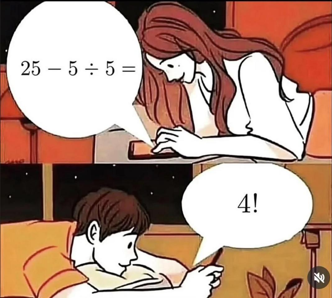
I find this to be unironically both easier to read (by an incredibly wide, dyslexic margin) and faster to write and type.
Parenthesis consists of only two symbols that only require two keyboard keys and a single stroke of a pen to write compared to the four keys and varying strokes of the standard operators (aka. more efficient). But, far more importantly for me anyway, "+", "×", "*", "÷", all look nearly identical unless I stare the keyboard or problem for an agonizing century (waste of time, perhaps?) and even then it's a mystery whether my brain processed the symbology correctly or put the numbers in the right spot to do math (yep, waste of time). The humble ( ), however, is very easy to see, and it creates neat little windows that don't leave much room for misinterpretation.
2*7²+5*3³ = accessibility nightmare
(2(7²))+(5(3³)) = readable with clearly defined order of operations
I did preface this by pointing out I'm weird.