Yes this is correct and actually I can see why you would want it. I purposely don't interact with many pictures precisely because I would rather keep them in my feed than add a comment.
comments
comment on
1-Click Hide Post in Feed
comment on
1-Click Hide Post in Feed
That's actually a good hint on the problem that I see; if it was not just pictures, but articles, you'd want to READ (open) them. But reading them would make them disappear with the setting that Rimu kindly pointed at (“Do not display posts with which I have already interacted (opened/upvoted/downvoted)”).
comment on
1-Click Hide Post in Feed
I see rimu already mentioned. I have that setting and just now hit the read button. I love to not mark animal pictures as read so that when I refresh I see them again as I scroll through.
comment on
Help theming my community
Thanks, this is the kind of answer I was looking for.
comment on
Help theming my community
Hey, I wrote that guide! I'll try to help simplify it a bit.
tl;dr of creating a basic theme is that all your css changes live in a styles.css file inside your theme's folder.
Here is what you actually need to do to create a theme:
First, you will need some way to experiment with css yourself to create your theme. That can either be running a development instance where you do your work (relevant guide), or it can be something like running a browser extension that lets you define a custom css to a web page (like stylus that was mentioned in the theming guide).
The actual process of defining what your css should be is kind of tedious. If there is an element on the web page you want to apply styling to, you can right click -> inspect on that element to see the page source for it. That can help inform you about any css classes or an id that might be present on that element to help you write your css selectors. If there is an element where a custom css class would be really helpful, you can either add it yourself if you are going the full local development route by editing the relevant jinja template, or you can ask in the PieFed matrix room for it to get added to the source by somebody else to make your life easier.
I am not really a css expert by any means, but you can reference the css changes that other themes make by browsing the different themes and looking at their styles.css files (link to themes folder).
Once you have a file with all the css changes you want for your theme, the next step would be to get your theme added to the source code. That is where you would reach out to rimu and pass your css to him. He would likely do a QC pass on it before adding it to the main project.
Then, when the next version of PieFed is released and is live, your theme is now part of the project and should be select-able as a community theme! Well done!
comment on
Default PieFed CSS
The themes in PieFed usually consist of a single css file that overwrites the default css where wanted. I wrote some documentation about the css and theming that you can refer to.
- Here is the theming guide I wrote.
- Here is where I talk about how PieFed uses sass to generate the default css.
I've pushed an update to hide code buttons.
Btw, to get notified about updates, you can subscribe to this rss feed
comment on
An inquiry regarding Piefed CSS
I checked. I've got my expand mode on.
comment on
An inquiry regarding Piefed CSS
Compact mode is a choice that is in your profile. It's not a server setting.
Go into Settings -> Compact UI and choose "Not Compact - Expand Images"
comment on
An inquiry regarding Piefed CSS
@Jerry@feddit.online would it be possible for you to uncompact it for my communities ?? They would look even more beautiful then.
comment on
An inquiry regarding Piefed CSS
Probably, you have compact mode on.
comment on
An inquiry regarding Piefed CSS
I think you can change that with your settings :)
Here is the full personalization you can achieve with Piefed :
https://piefed.social/community/fediverse/wiki/piefed-user-css
Are you a piefed developer ??
comment on
Stop cropping tall images
Was going to post for the same. This works fine, too:
.post_teaser_image_preview a { max-height: none; }
I see you already got the background color of the navbar sorted. As for the text color, if you really want to change the text color for pretty much everything that isn't a link (including stuff like icons), then you could do something like this (using red as an example):
* {
    color: red;
}
However, you might want to be more selective and only change the text color in certain areas.
- Post body and comments:
body {
    color: red;
}
- Text in the cards on the sidebar:
.card-body {
    color: red;
}
- The color of hyperlinks:
a {
    color: red;
}
[deleted]
FYI: The browser's Web Developer Console is super helpful to poke at things. You right-click on an element and choose "Inspect". And a tab will open with something called Inspector or Elements. And you can then mess with the styles and change them around to see what you like. It's temporary changes, so a refresh will revert everything. Somewhere below the HTML there will also be an overview with how to access the element. Unfortunately it's not super straightforward to make sense of it without prior knowledge of CSS.
I'd say the navbar is something like this:
div.navbar { background-color: aqua; }
.nav-link { color: red; }
comment on
How to hide the emoji "message reactions"?
Nice! Thank you very much.
comment on
How to hide the emoji "message reactions"?
You were really close, you need to hide the outer container that the .message_reaction is in. Here you go:
.message_reactions {
    display: none;
}
👍 1
comment on
PieFed Custom Themes?
that's eye bleeding
comment on
PieFed Custom Themes?
[deleted]
comment on
Lemmy/old Reddit styles
Looks good!
Some things I would prefer differently and wasn't able to properly get to work by editing this code of yours:
The space for an image should be used even if there is no image. Yeah, will waste space, but looks a lot nicer!
Also, I'd prefer the upvote buttons and such to be underneath the left part of the text, not as the righthandmost element!
So, here's how PieFed looks with your CSS:
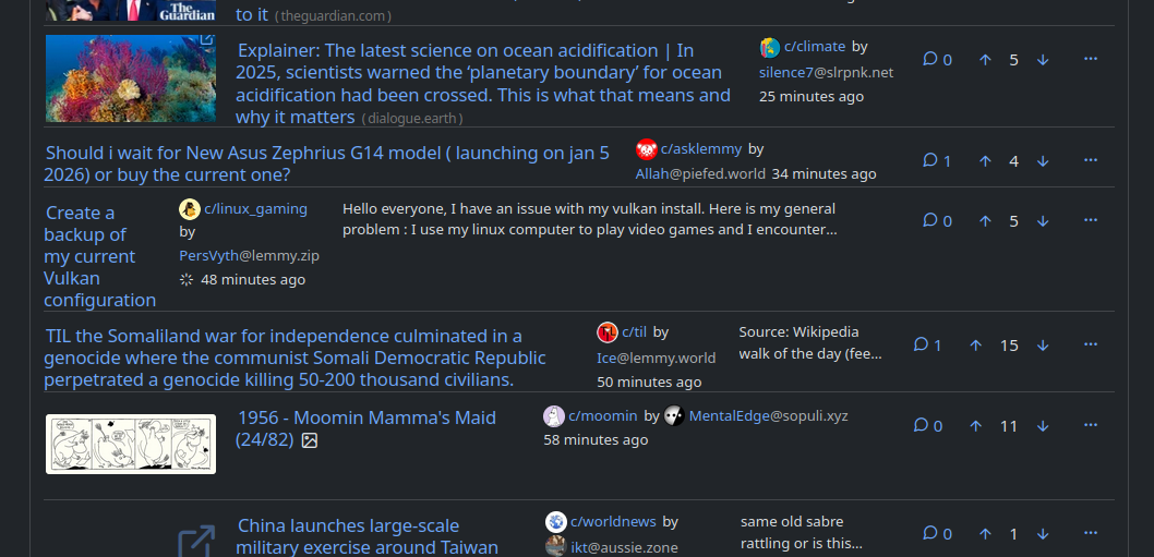
.
.
.
.
And here's what I did with an image editor to show what would be the most very awesomesest look:
(though, I am not sure if the preview text makes the most sense where I put it now.
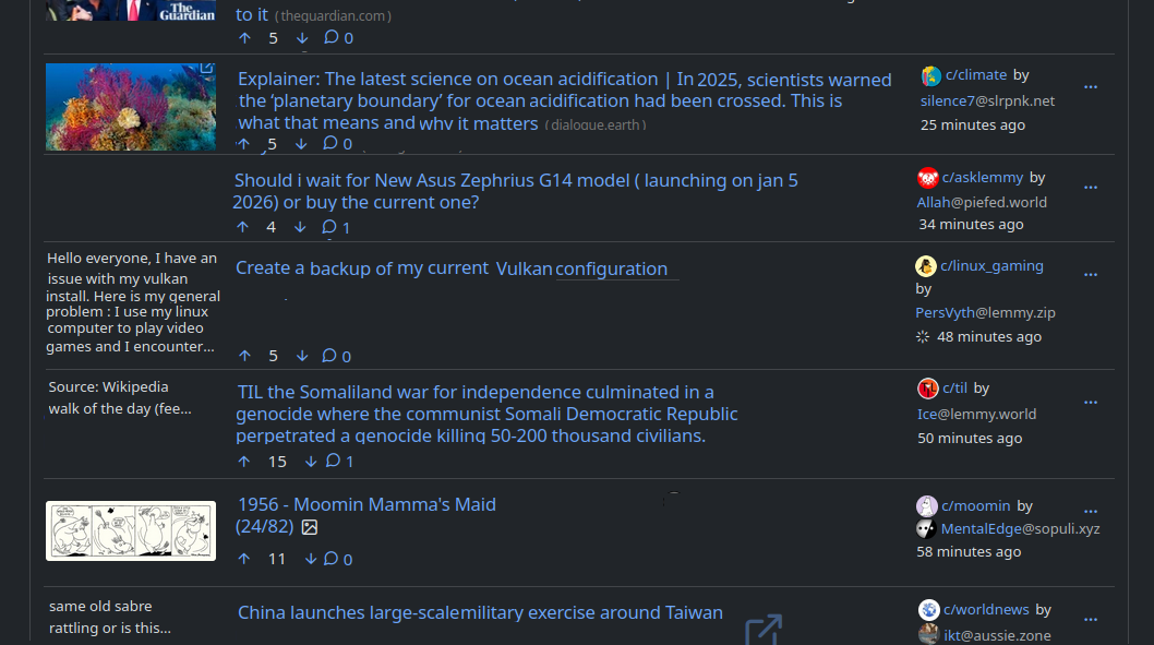
comment on
Hide scores
chefs kiss
comment on
Consistent Compact Layout
Thanks this is working really well!
comment on
Consistent Compact Layout
The elements are positioned via the use of CSS grid. Horizontal position is set with the grid-column property. So if you set the grid-column for the previews to 1, and shift everything else's column over, you should get the images on the left.
view more:
next ›