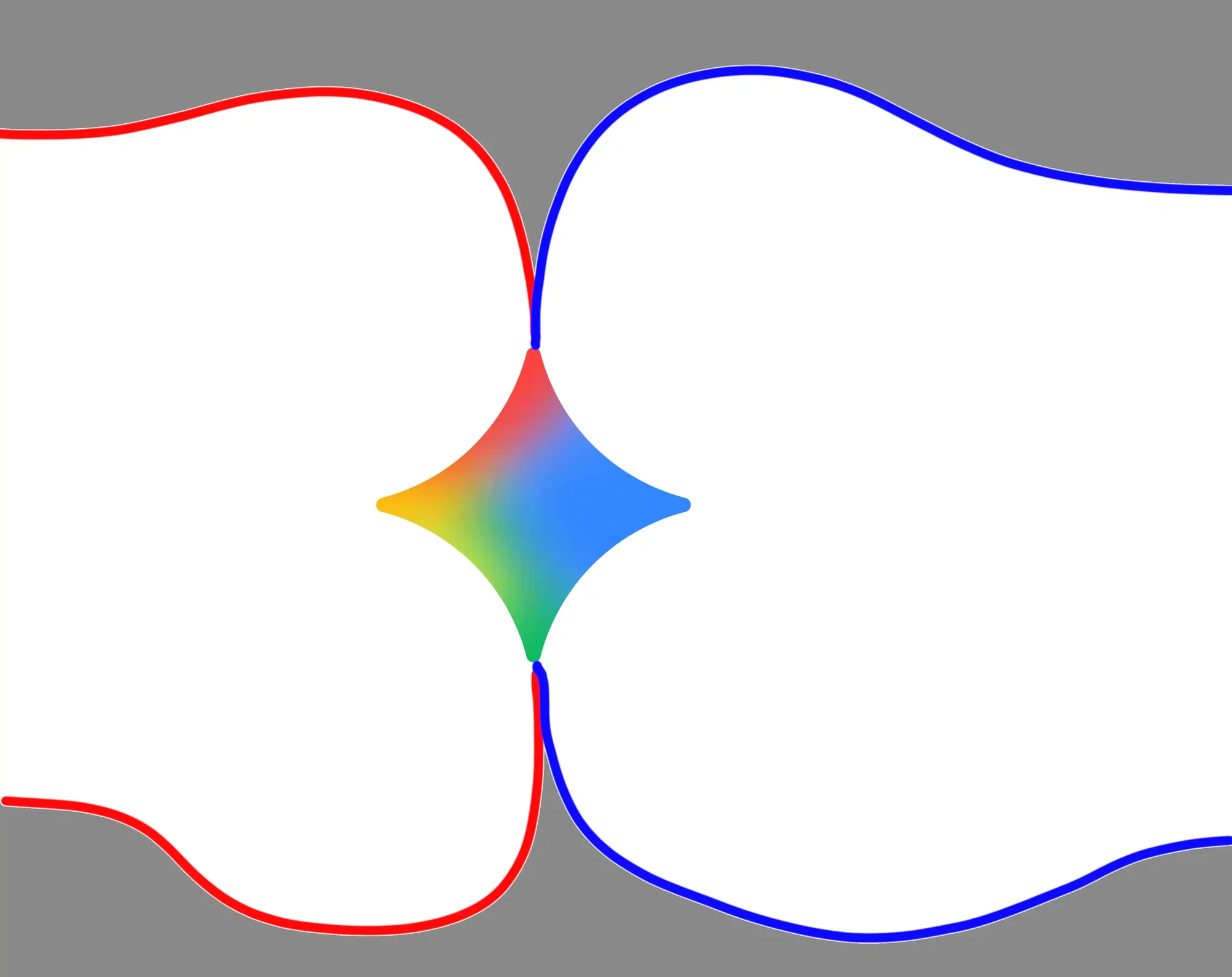
i think the answer is that they want to be a black hole that sucks up everything and everything revolves around. grok is particularly unsubtle about it, but everything else kinda follows the same theme too, they all have either a swirl or a star, or both