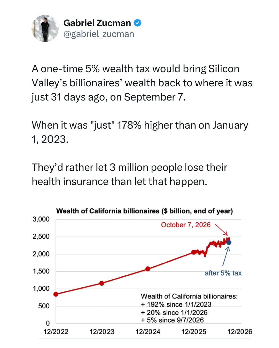
A one-time 5% wealth tax would bring Silicon Valley’s billionaires’ wealth back to where it was just 31 days ago
(slrpnk.net)
A one-time 5% wealth tax would bring Silicon Valley’s billionaires’ wealth back to where it was just 31 days ago, on September 7.
When it was "just" 178% higher than on January 1, 2023.
They’d rather let 3 million people lose their health insurance than let that happen.
Graph here: https://cabillionairetracker.org/
Rather than paying their fair share of taxes, Sergey Brin, Pether Thiel, and Patrick Collison prefer to spend tens of millions to manipulate the vote.
Stupefying levels of greed and lack of civil-mindedness.
$45 million in a week: California’s wealthy aren’t holding back to try to stop ‘billionaire tax’
All credits to Gabriel Zucman