Paywall bypass: https://archive.is/5iAVx

you are viewing a single comment's thread
view the rest of the comments
[–] 62 points 1 year ago* (12 children)

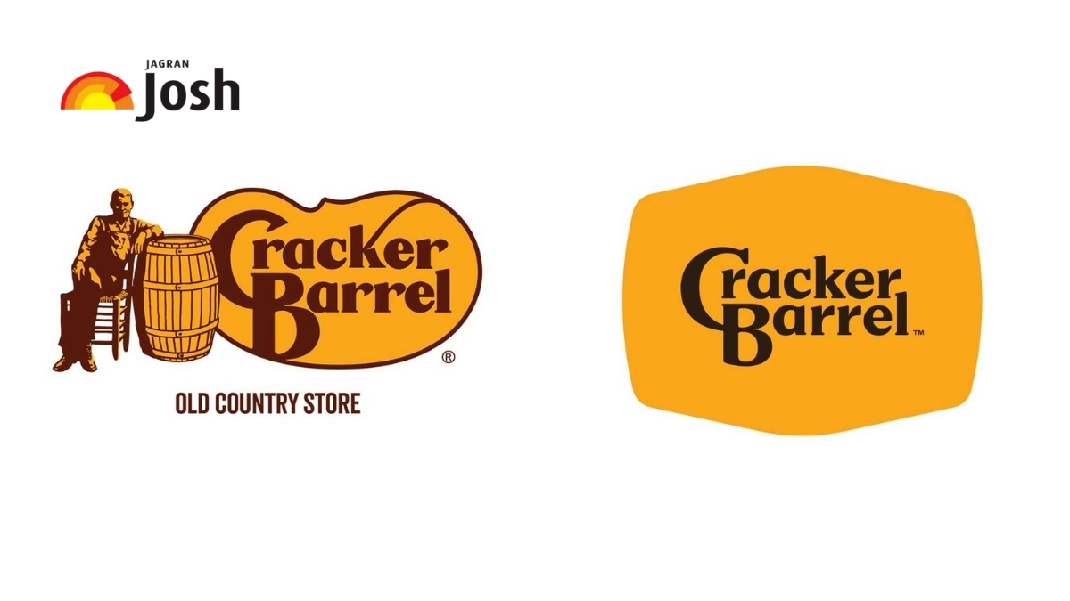
Here's a logo comparison of old to be, because the article didn't for it for some reason:

Web site this image comes from.

  • source
  • hideshow 12 child comments
  • [–] 33 points 1 year ago (6 children)

    Definitely worse, no doubt about it.

  • source
  • parent
  • hideshow 6 child comments
  • [–] 4 points 1 year ago (5 children)
  • [–] 4 points 1 year ago* (2 children)

    It looks MORE like it's from the 70's.

  • source
  • parent
  • hideshow 2 child comments
  • [–] 3 points 1 year ago (1 child)

    Maybe that’s the goal. Is Dennys still around. This reminds me of their logos general shape, but melted.

    I like it the direction, but the topography needs adjustments. Full disclosure I’m also a design snob with a fucking BFA who got stuck coding shit for the last 20 years.

  • source
  • parent
  • hideshow 1 child comment
  • [–] 2 points 1 year ago

    I mean like the UV brittled plastic retro microwaved steak & potatoes with a sprinkle of asbestos variety of looking like the 70's. Not the nostalgia kind. It's a vibe and i guess it fits the restaurant.

  • source
  • parent
  • [–] 14 points 1 year ago (3 children)

    The personality got sucked out, and all that was left is a indistinct husk.

  • source
  • parent
  • hideshow 3 child comments